Christmas cards!
For the last six year I have designed and sent Christmas cards to friends, family, and colleagues. I figured I would make a small blog post about them because some thought does go into it every year. I’m not a big Christmas person — I don’t like the music, I don’t decorate, and I like eating well any day of the year (whilst avoiding gluttony). However, Christmas does present the perfect opportunity to send a card to others to remind them that they’re awesome.
One of my main gripes with commercially available Christmas cards is that they all look quite dated. Picture what a Christmas card looks like. You probably think of something like this:
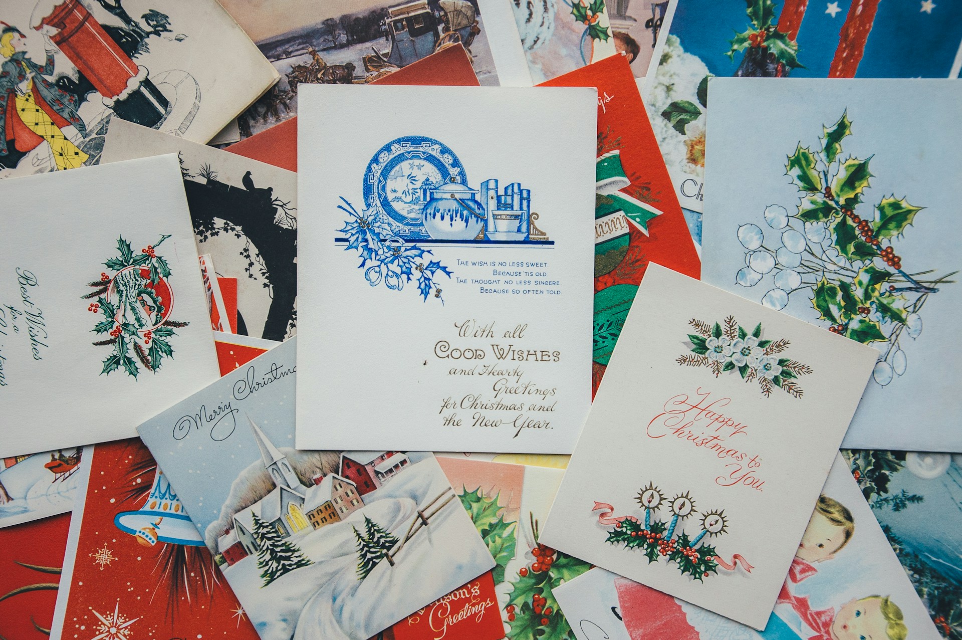
For some reason, even though it’s 2025, Christmas cards by and large look like they could be from 1975. I wanted something a bit different, more modern, so as someone with paper and typesetting as hobby, I drew the logical conclusion that I should probably make them myself. The idea was quite simple: think of what you expect a Christmas card to look like, and then do the opposite. Plus I don’t really need to sponsor Hallmark, especially as in 2019 they pulled an advert showing a lesbian couple from the Hallmark Channel after pressure from a conservative group, and somehow getting your own cards printed is cheaper than buying them in a shop. (Sadly I can’t find the physical versions of the first two cards, so I printed those again for this blog).
2019
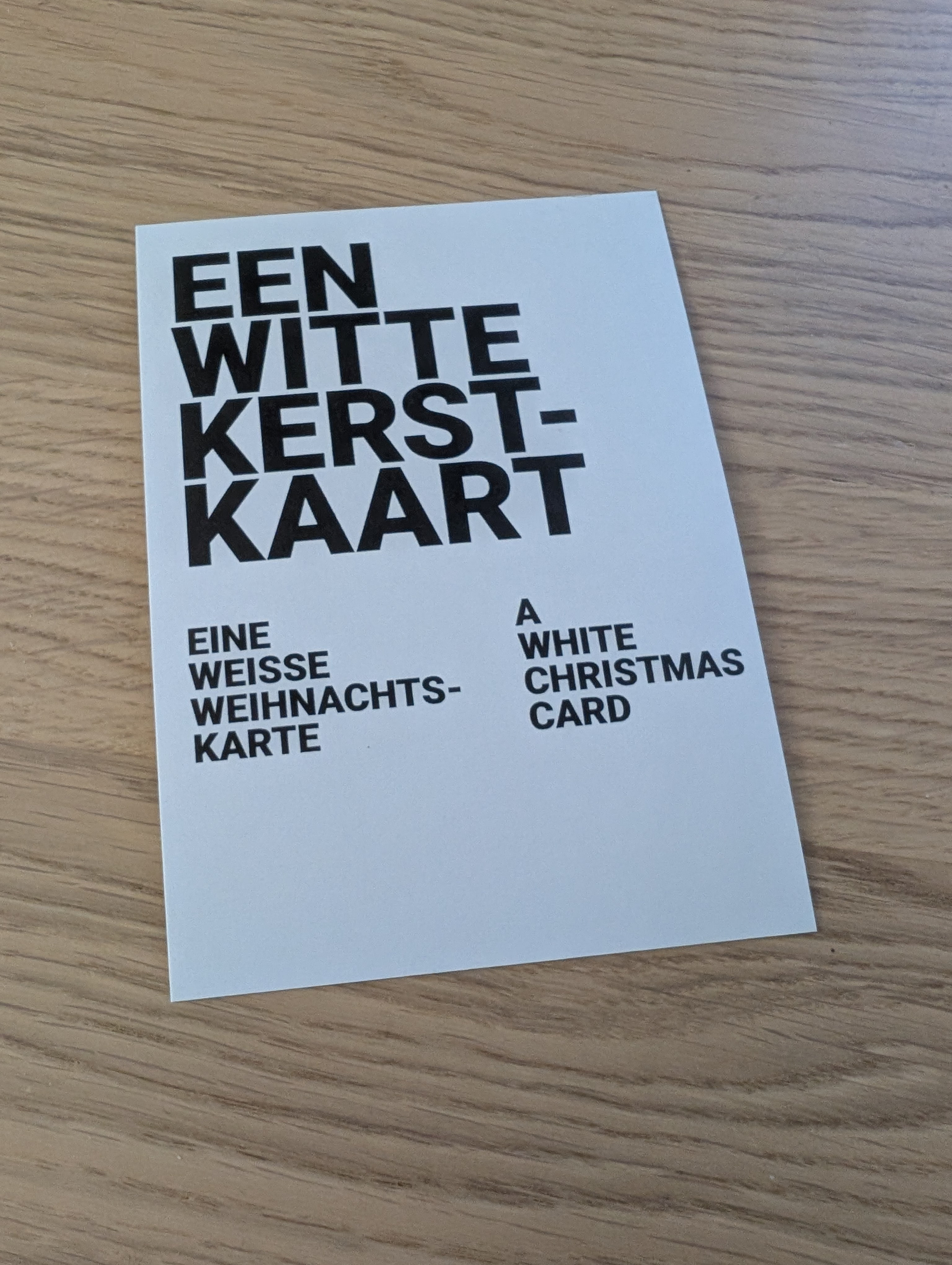
This was the first card I sent. I initially wanted to make it like a fridge or oven manual in 15 languages but that idea fell through. However, even at just black and white it stood out quite well between the other cards. Originally it was not a postcard but a foldable card. In hindsight I would have not added three languages to the front, but oh well.
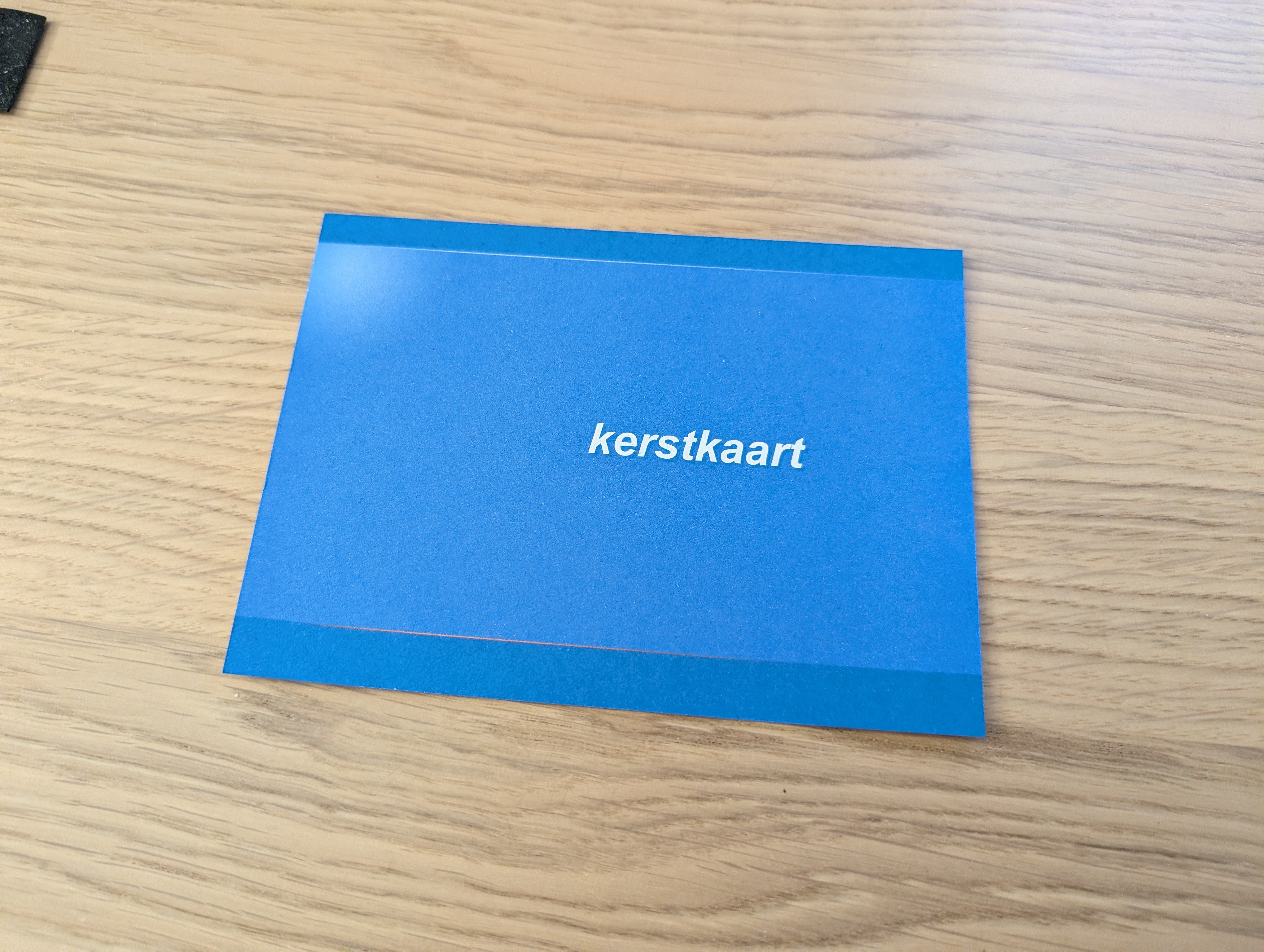
2020
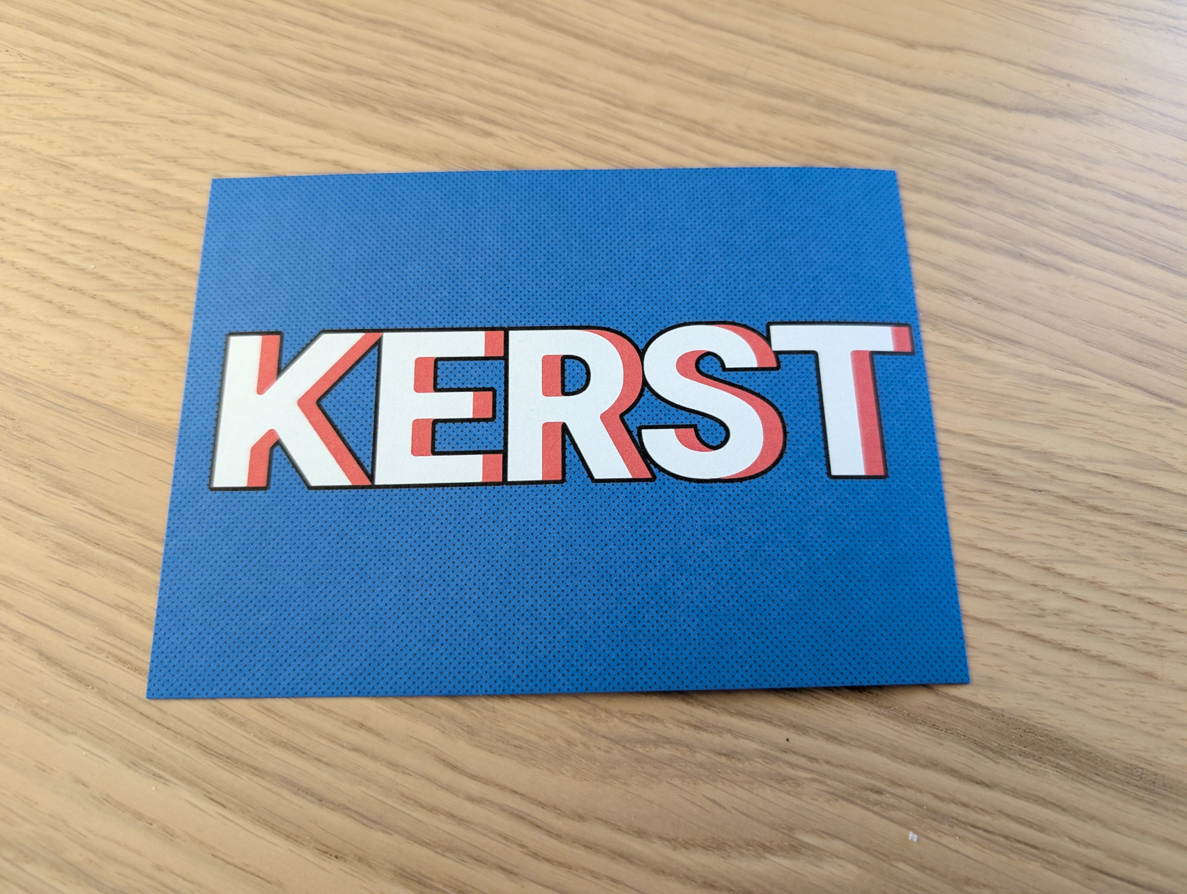
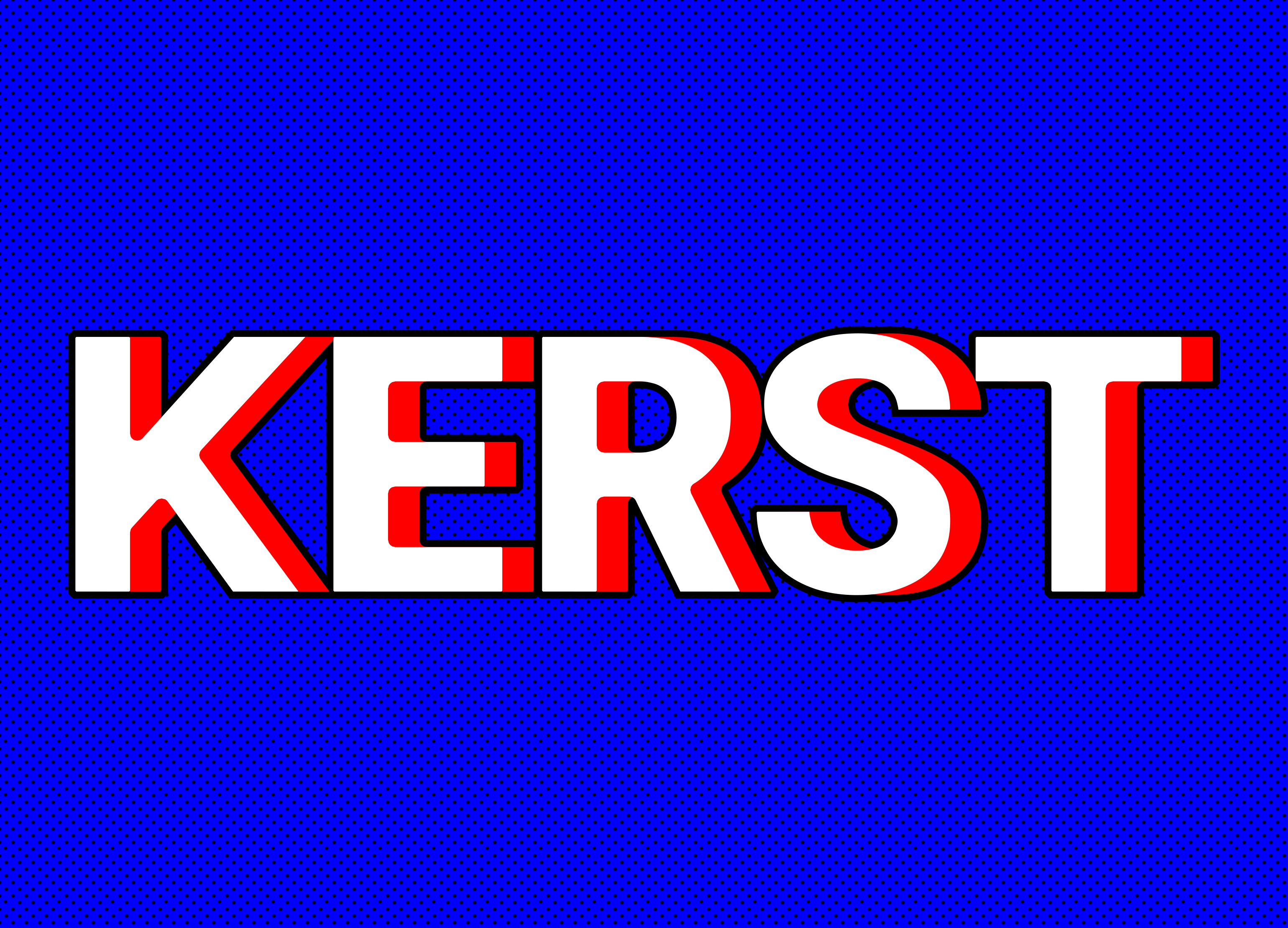
The next year I wanted something very bold. I used pure RGB-blue and RGB-red for the colours. Somehow in the reprint the right side is slightly cut off. The digital version is a bit more vibrant:
2021
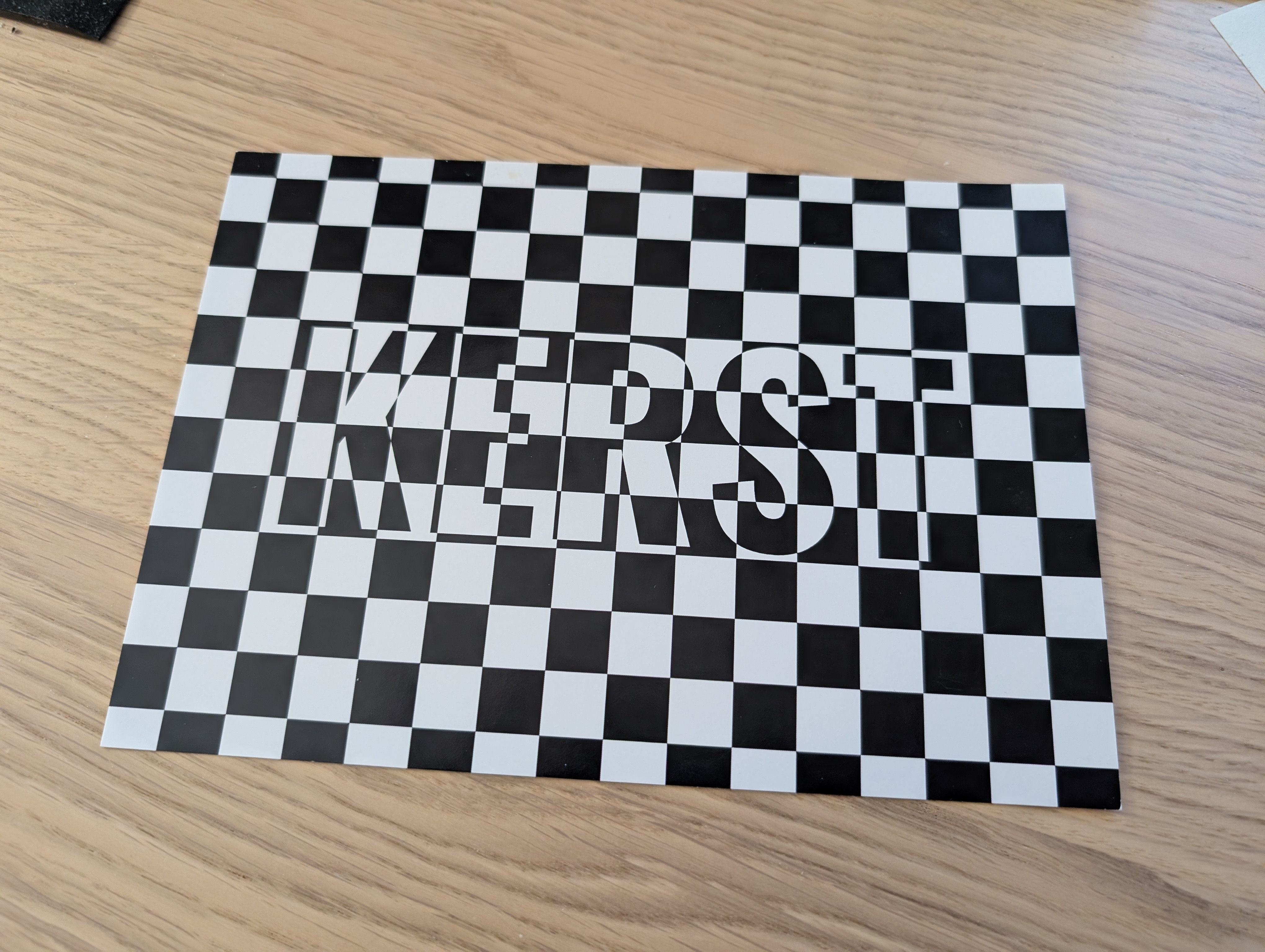
Back to black and white. One of the most trippy ones I have made. I do quite like this design though because it really stands out. In many cases I sent these as postcards without envelope, so even when opening the postbox it must have been quite a sight.
2022
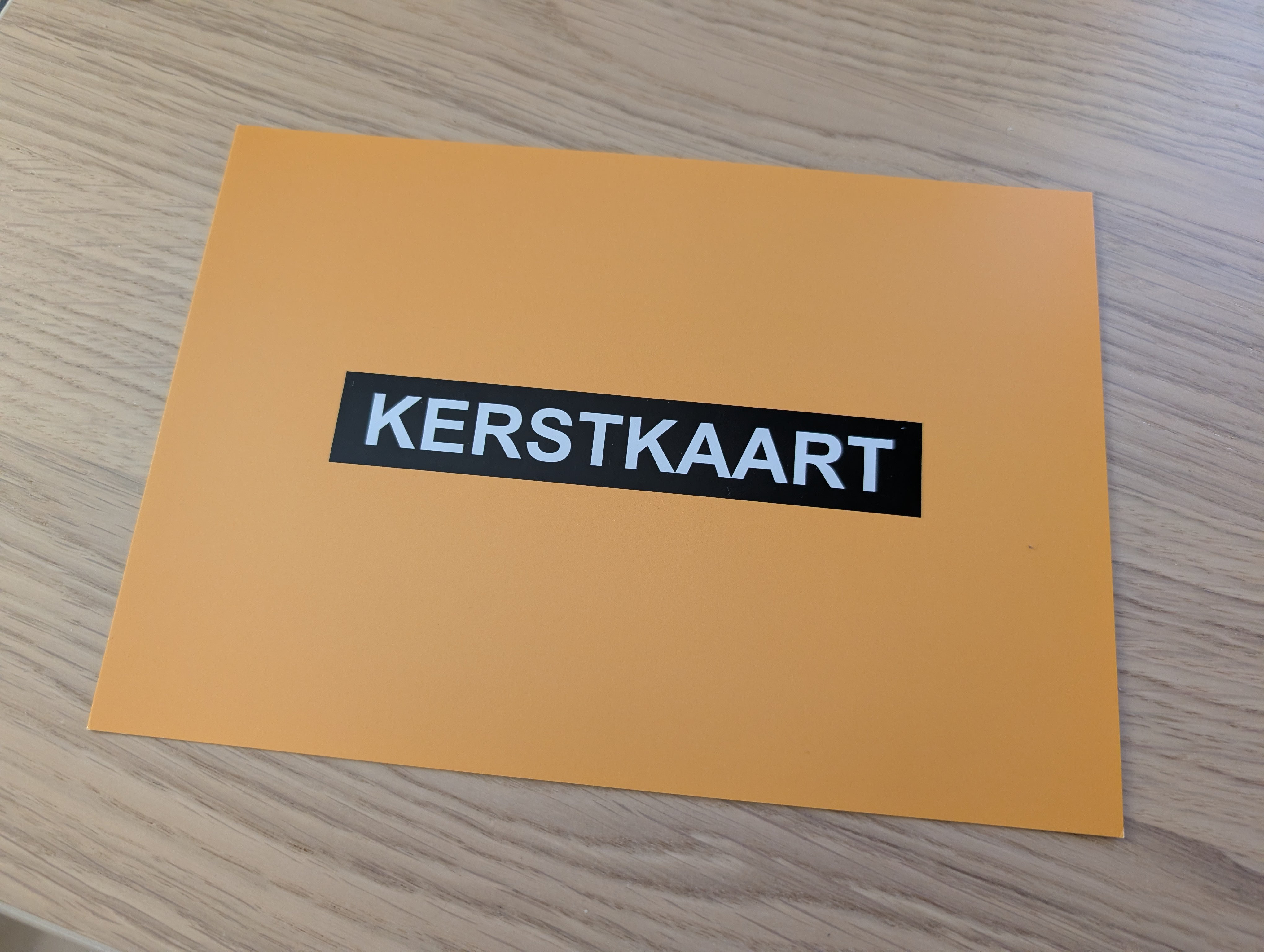
Which colour is not associated with Christmas? Yellow! Plus it also happens to be my favourite colour. And around this time I switched my “corporate identity” over to this style. Basically I like the Inter font and minimalist design (also because that’s what I’m good at). You can see this style on my website and blog as well.
2023
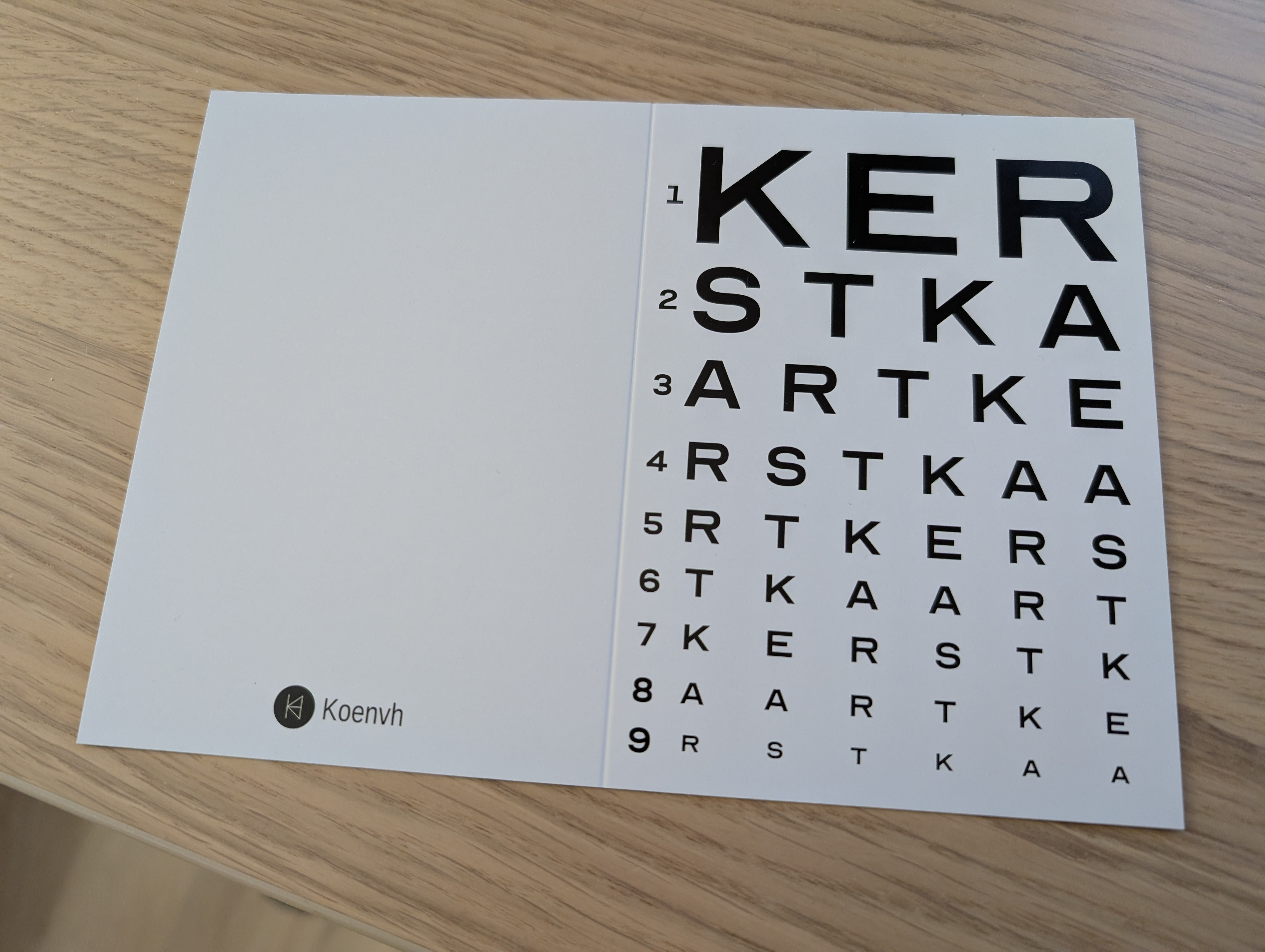
Coming up with a new idea every year is not easy. Eventually I came up with the idea of a Snellen chart that anyone who has been at the optician’s should recognise. Again black and white, because somehow less colour stands out more, plus I have never seen those charts in colour.
I also went back to foldable cards. One of the reason I had been using postcards before is because they are cheaper. Turns out a lot of printers make money by selling you overpriced envelopes (which sometimes doubles the total price). I prefer foldable cards normally because it’s a bit easier to write text in them. I also stopped preprinting the contents, and instead I would write everything by hand. That was easier for different languages (half my cards go abroad) and different messages.
2024
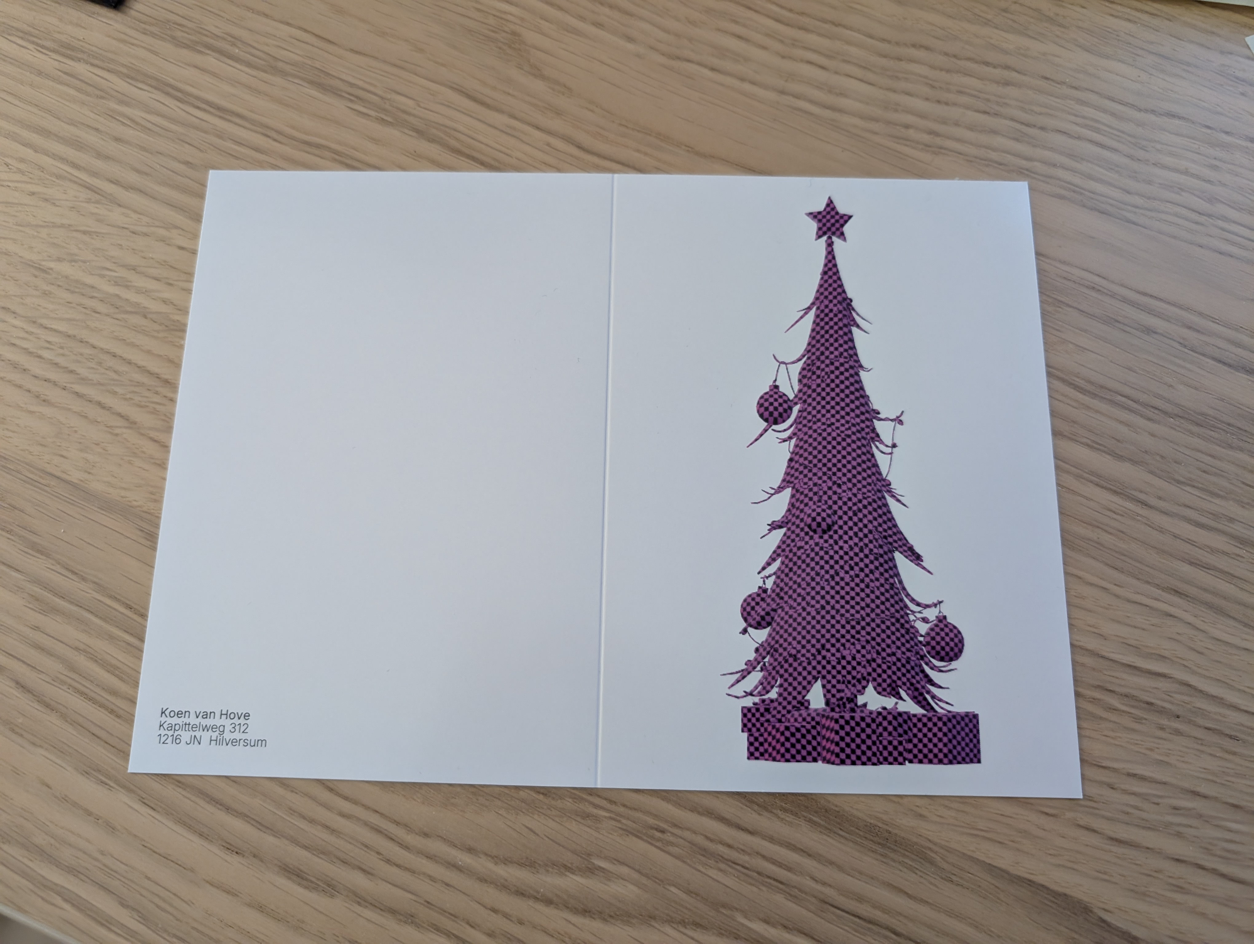
This was the first card without the word “Kerst” on it. It’s a Christmas tree with the “missing content” texture from the Source Engine, which to gamers of a certain age probably looks recognisable as “someone forgot to instead CS Source”. I also wrote my address on it because rather than my logo, in case someone wanted to send a card back, because I do like receiving them (hint hint nudge nudge).
2025
This year I was really late with coming up with an idea I liked. So late in fact that at the moment of writing (26 December 2025) most cards have not been delivered yet, and I fair quite a few might be delivered next year. I also had no time to get them professionally printed, though luckily my HP printer and stack of ~250 g A6 cards did wonders. I think it would have looked better printed on glossy card paper. The keen eye will recognise it as a parody on the logon screen for Windows XP.
2026?
With a bit of luck I come up with an idea for 2026 in time. It seems like international mail has become a lot slower, taking a month to get to the USA. That means taking printing time into account the design needs to be done early November. Oh, and stamp prices keep increasing, but complaining about that makes me sound old :-) I do want to see whether I can do something more with different paper types.
Anyway, those are the main ones I have made. And to finish off, here is one specifically about RPKI. If you know the RPKI and/or computer networking you might like it. If you’re not into that field it’s too long to explain :-)